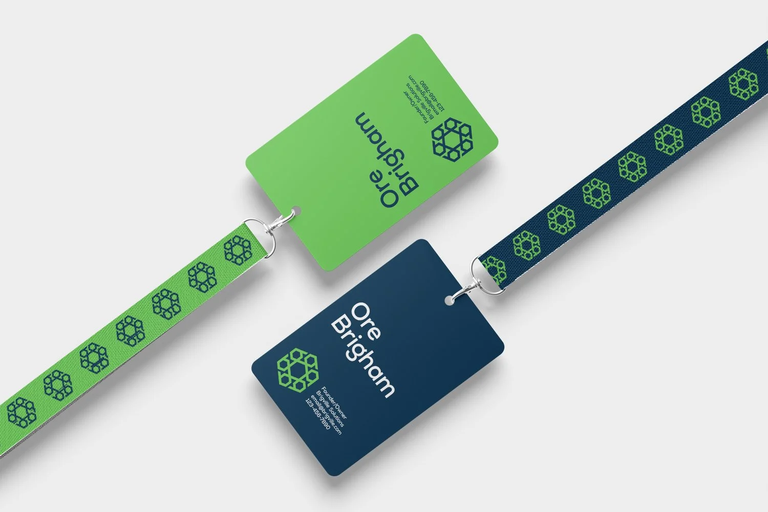
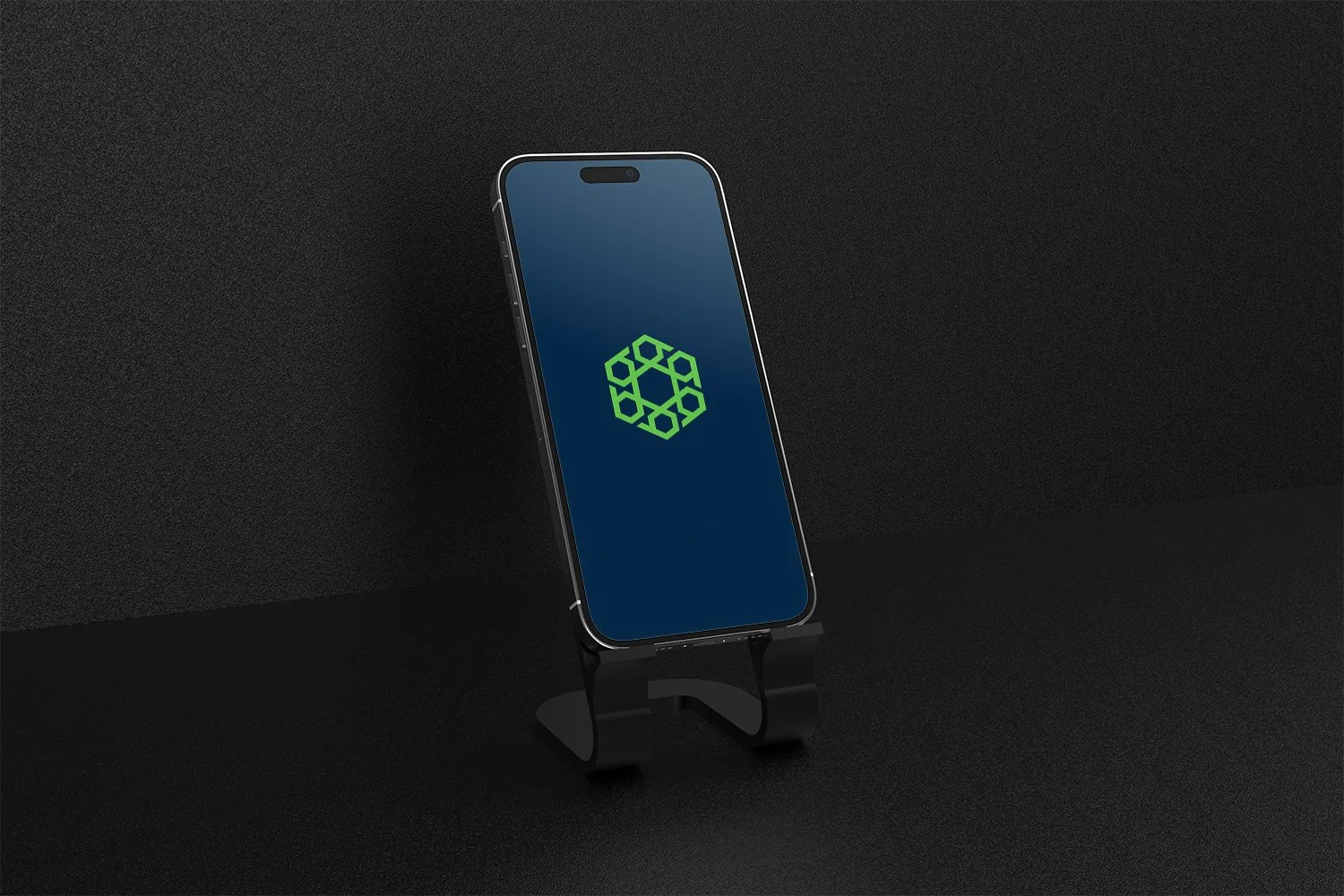
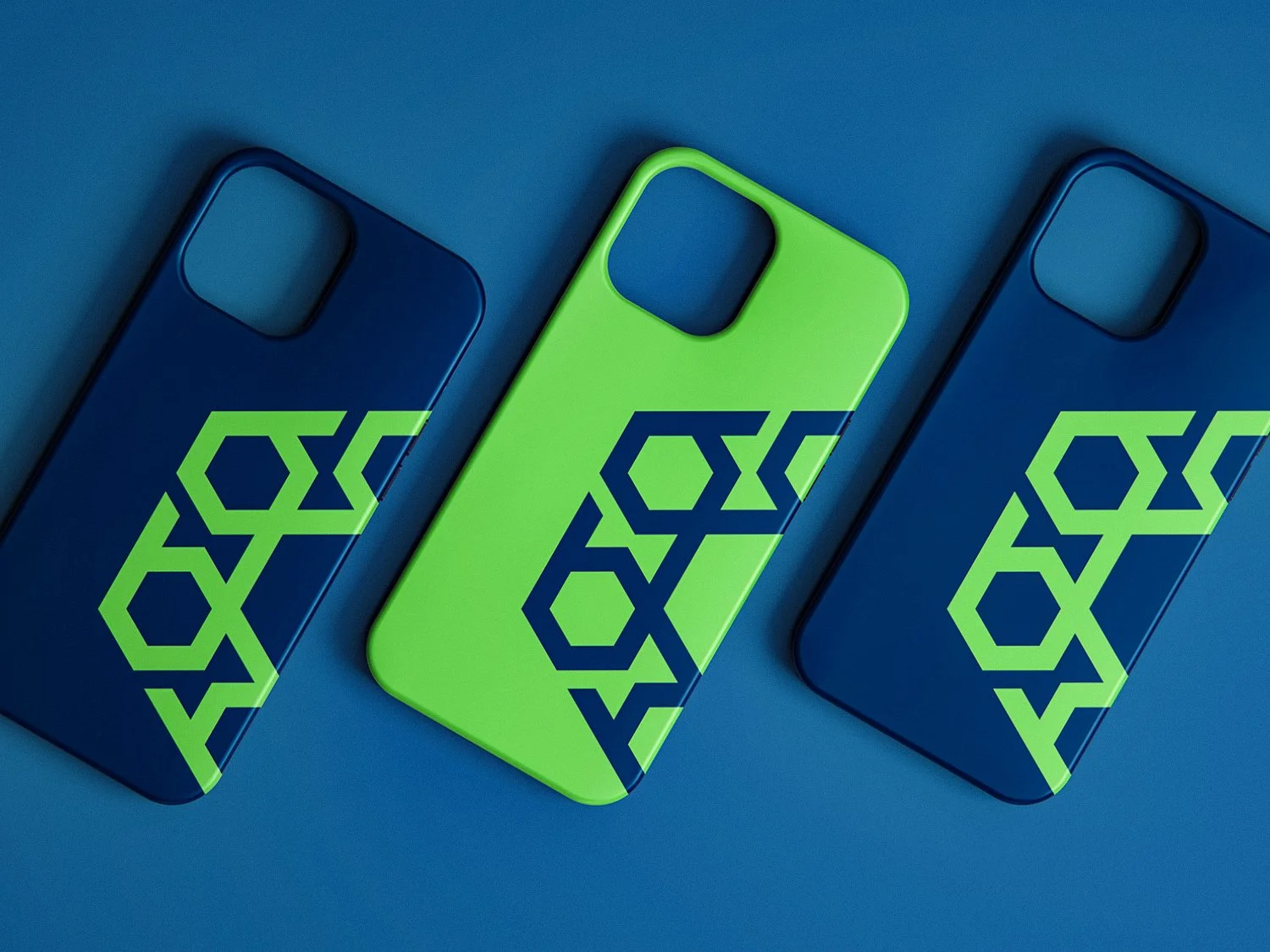
Brigville Solutions
Service(s): Logo Design & Visual Identity
Year: 2025
Brigville Solutions is a digital automation consultancy helping organizations streamline workflows, eliminate inefficiency, and unlock scalable productivity. They partner with organizations to modernize their operations and deliver solutions that improve and transform organizations.
They came to me in need of a new visual identity to get the business up and running. Our goal was to create something that conveyed ideas of subtle confidence and efficiency.
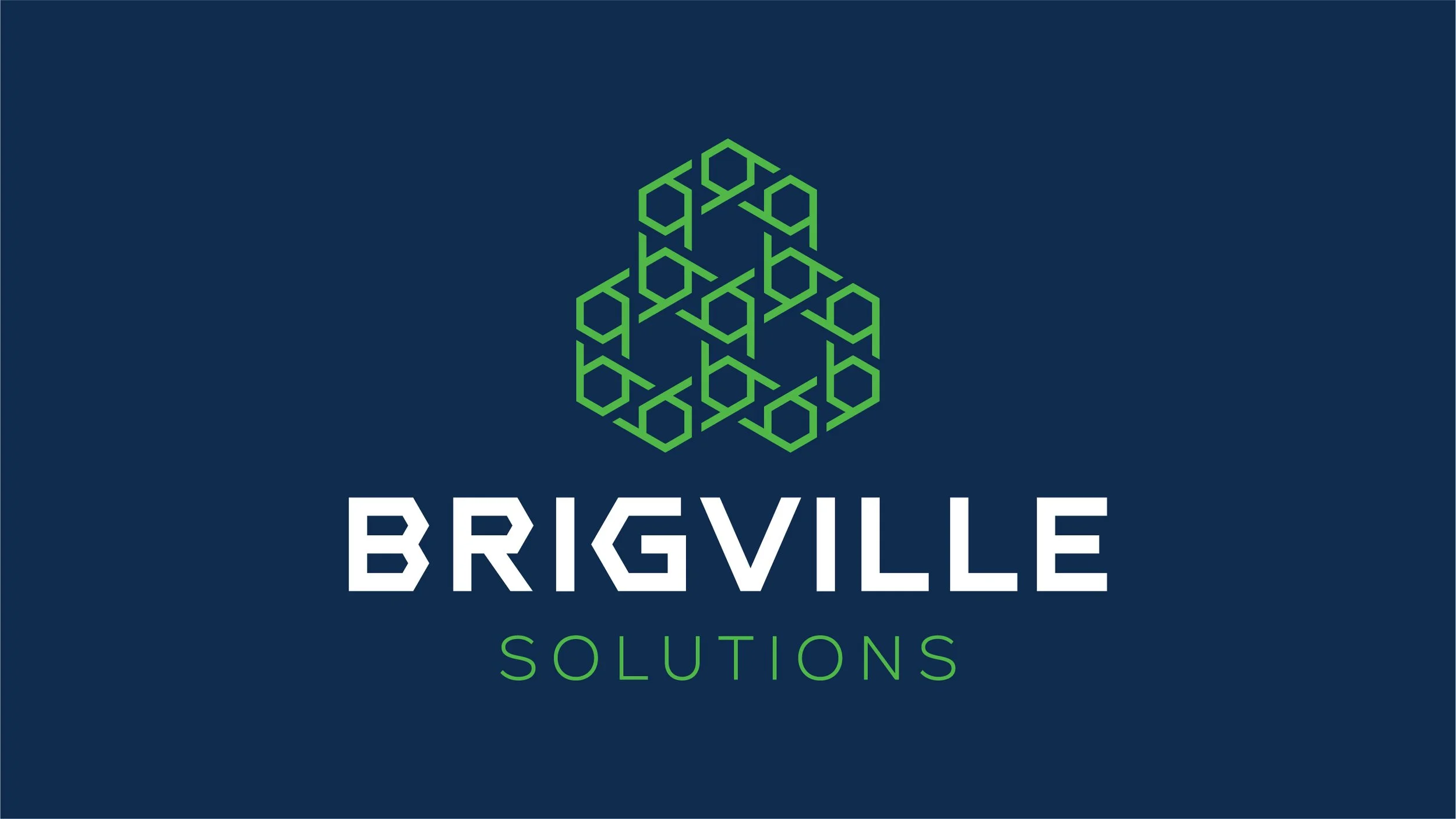
The Concept
I wanted to design something that told a story of efficiency. It was also important to convey a sense of strength and confidence, alluding to the extensive knowledge and experience Brigville Solutions has. Although this wasn’t an essential part of the brief, I also wanted to incorporate some element of the business name into the logo mark.
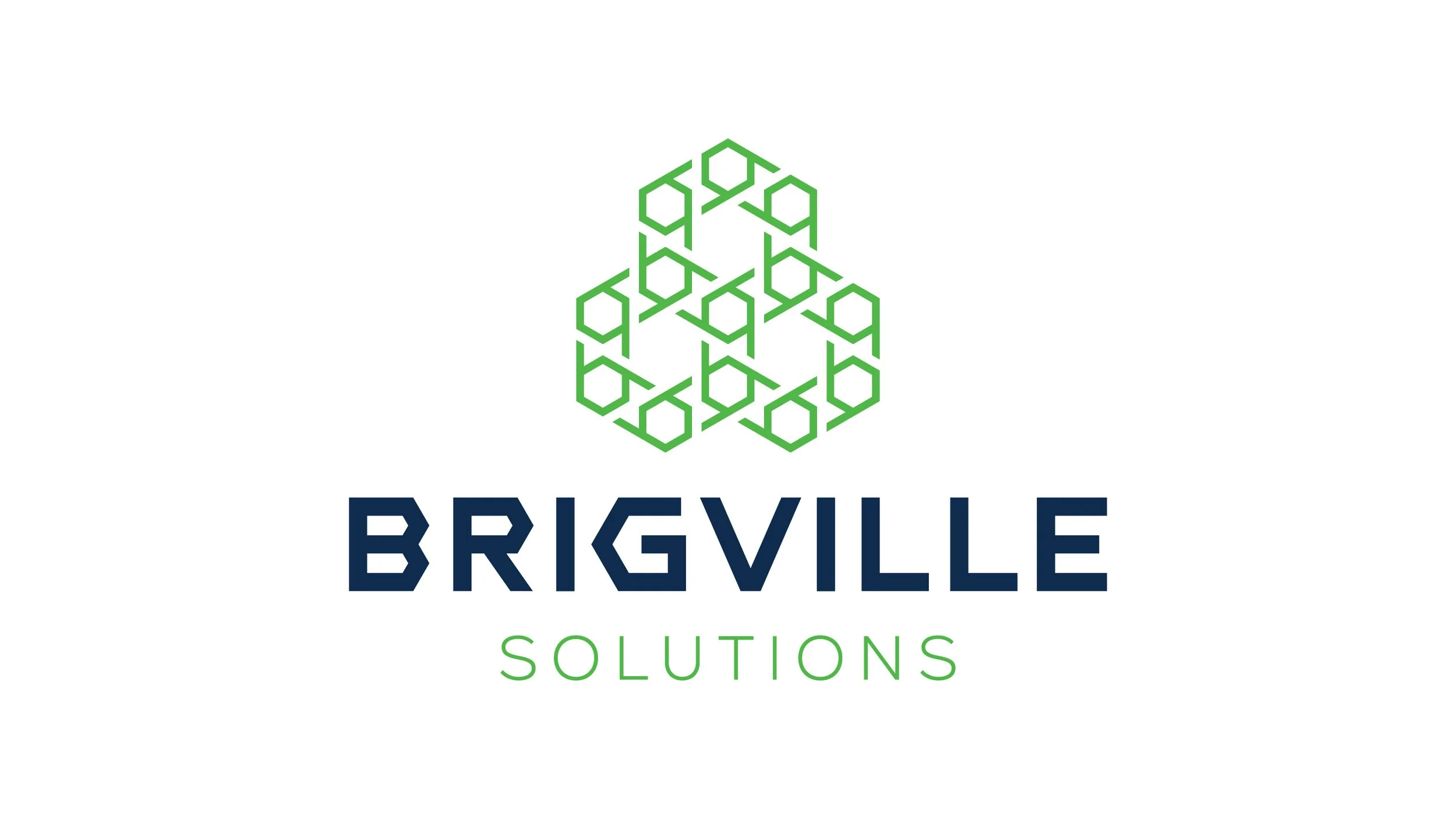
Lowercase “B”
A nod to the name of the business, the logo uses a series of lowercase B’s (as in Brigville) to create an abstract logo mark.
Shield/Gear Icon
The logo mark takes the shape of an angled shield and gear (or a nut, as in nuts and bolts), conveying symbols of strength, mechanics, and efficiency.
Honeycomb
The honeycomb perfectly symbolizes efficiency. The precise shapes lock together to represent structure and organization.
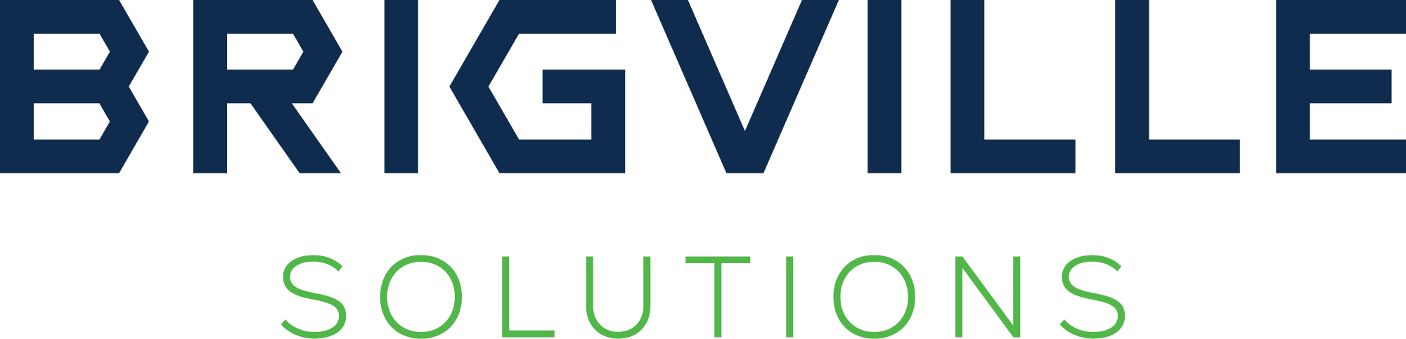
The Logotype
The wordmark uses a custom geometric typeface that borrows angles from the logo mark for the “R” and “G” letters. The word “Brigville” is the focal point, using a heavier typeface and darker color to create the correct hierarchy.