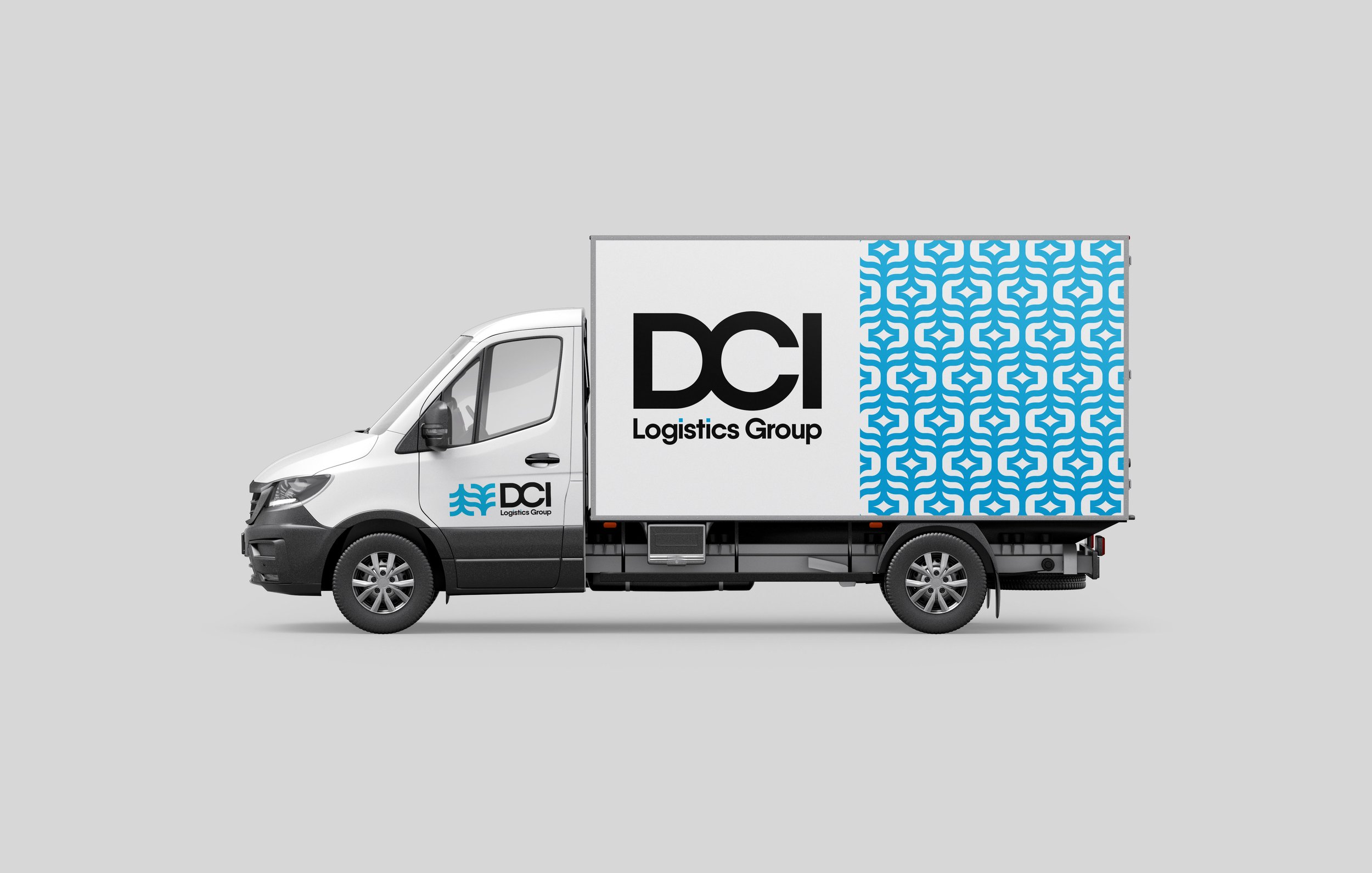
DCI Logistics Group
Service(s): Logo Design & Visual Identity
Year: 2024
All work done through Think Big Picture.
DCI Logistics Group is a logistics company based in Wilmington, NC, specializing in over-the-road shipping with a commitment to reliability and efficiency. Known for delivering exceptional service, they prioritize building strong, lasting partnerships with their clients. With a customer-first approach, DCI Logistics Group ensures every shipment is handled with care, precision, and professionalism.
Jason (better known by his last name, Carter) needed an identity that conveyed the core values of his business—dedication, communication, and innovation. The goal was to create something clean and modern that set him apart from his competitors.
The Concept
There were a few points Carter brought up on our discovery call that stood out:
BRAND AWARENESS
There’s a distinct lack of brand awareness among his competitors. This presented us with an opportunity to create something unique.
FAMILY/TEAM
Everything he does is relationship-based, both internally and on the customer side. He mentioned that working with his company should feel like a family or a team, so it was important to incorporate that.
CUSTOMER SERVICE
Customer service is essential. Providing his customers with expertly reliable shipping and logistics services and reliable communication is paramount to DCI’s foundation.

Family Tree
Incorporating a “family tree” tells the story of family and team. With that being such a foundational part of the business, it felt important to include in some way.

Directional Arrows
These arrows are meant to represent direction and movement, representing the shipping side of the business.

Connection & Logistics
The arrows intertwine to create shapes that represent connection. The connection is indicative of both connecting with clients, and on a more literal level, interconnected shipping routes.
The Logotype
I chose Qanelas Bold for the primary logotype because it was a rounded bold font that fit the overall styling of the logomark. I joined the D and C to create harmony between the arrow shapes and the letterforms, and adjusted the overall kerning for a tighter, cleaner look. I made the dots of the i’s the same blue as the logomark to add a bit more customization.


