Design Projects
These are some projects I’m proud of that don’t necessarily fit into a full case study. They include logos, show flyers, social posts, and more.
Blue Dot Community
Logo Design
Blue Dot Community is a community-connection project at the Jersey Shore promoting physical, cognitive, & social health for individuals with & without neuro & developmental disabilities.
The concept of the “blue dot” is a refreshing outlook on people. When you zoom out on the world until it’s just a blue dot, it starts to put our differences into perspective. The goal was not only to capture this, but also to make it feel fun and inclusive.
The end result was a playful badge logo where the circle and letters loosely resemble the Earth.
Electric Audio Works
Logo Design
Electric Audio Works is the culmination of many years of study and exploration in the worlds of music and technology. With founder Austin White at the helm, Electric provides a space for artists and musicians to explore a vast universe of sound and creativity. They’re home to a large collection of rare and sought-after synthesizers, both vintage and modern.
We wanted to develop a bold, classic logo that paid homage to retro electronics logos while still feeling modern and timeless. The “AW” of the logo mark creates a sort of electronic/sound wave look, subtly hinting at what the company does, even when viewed without the word mark.
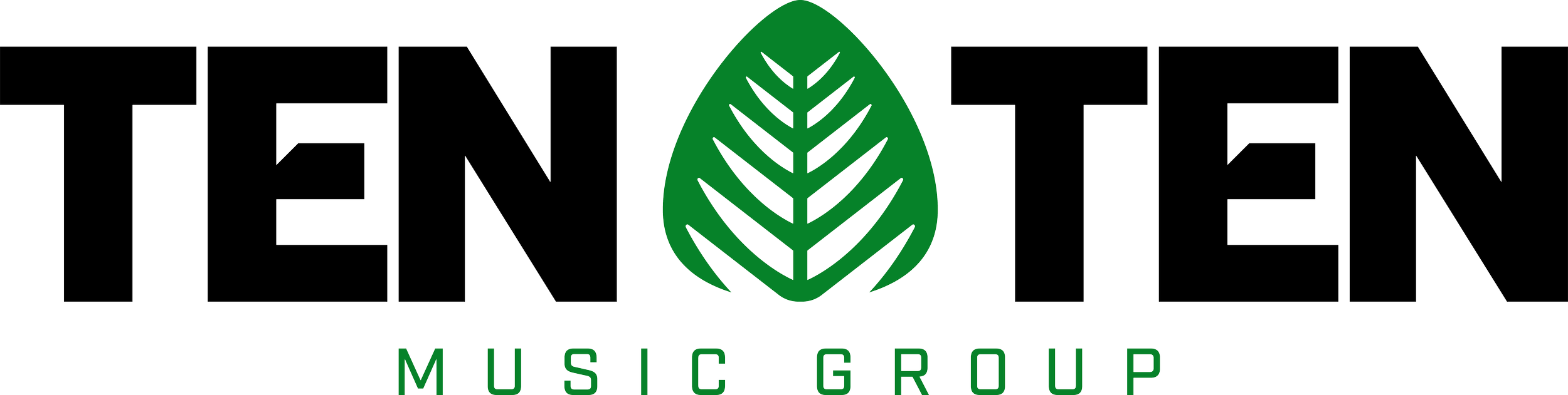
Ten Ten Music Group
Logo, Visual Identity, & Website Design
For over 40 years, Ten Ten Music Group has championed artists with vision, passion, and grit—nurturing careers, crafting timeless songs, and staying true to the music every step of the way.
TTM needed a full brand refresh, from the logo and visual identity to their website. They needed something cohesive and professional, celebrating their rich history working with so many incredible artists.
The logo combines the shape of a guitar pick, representative of the many talented guitarists in their catalog, and a silver fern, the national symbol of New Zealand, which is the birthplace of TTM’s founder, Barry Coburn. The notches in the E’s of the word mark also resemble a vinyl turntable needle.
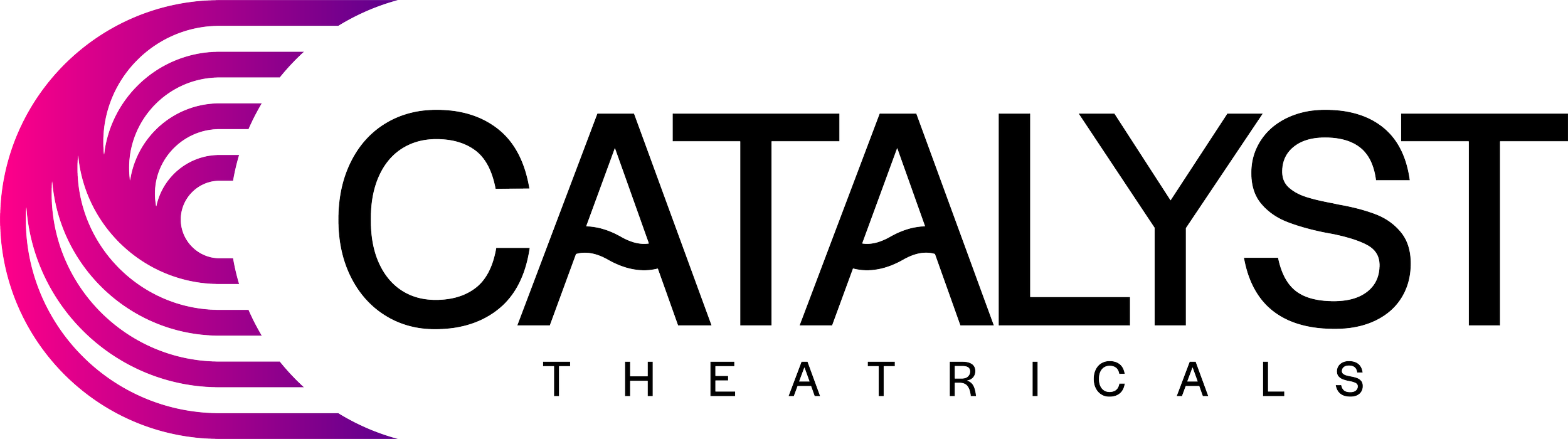
Catalyst Theatricals
Logo Design
Catalyst Theatricals offers a comprehensive range of services, including general management and executive producing for stage productions, creative consulting for emerging producers and artists, international productions and licensing support. With a commitment to tailored service and bold, out-of-the-box thinking, Catalyst Theatricals champions the unusual, the inspired, and the passionate.
The pillars of the Catalyst brand emphasize movement, responsiveness, and energy. The logo mark creates the letter C using rhythmic lines that create waves, because what conveys movement and energy better than water? I also customized the A’s in the word mark to further emphasize the wave concept.
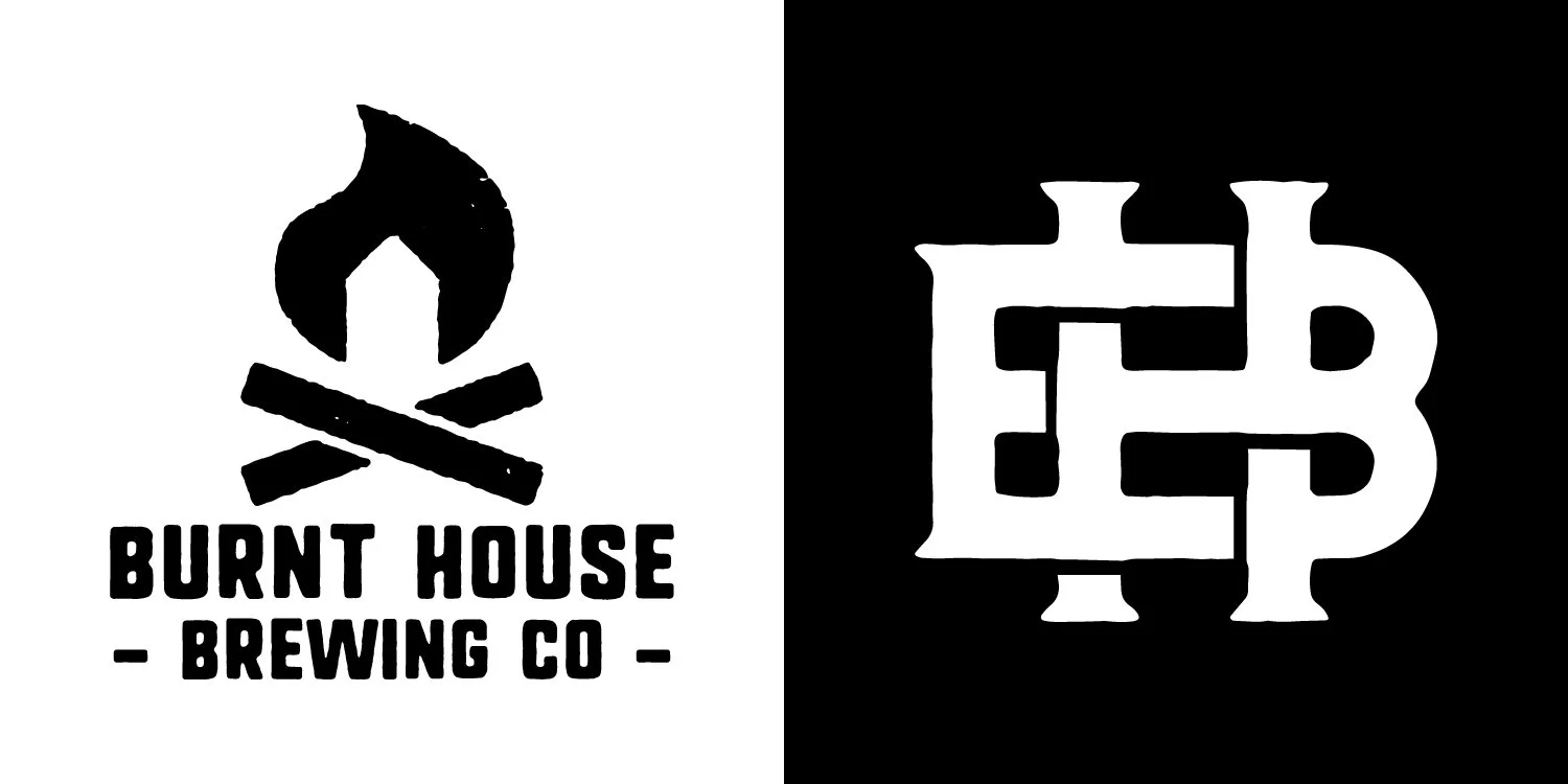
Burnt House Brewing Co.
Logo Design
This was a passion project for a close friend of mine. After his family's home tragically burned down, he decided to turn lemons into lemonade. He had a passion for home-brewing beers, so he and his brother started this small brand in remembrance of their home.
The primary logo combines a simple house shape with a flame, and the alternate creates a BH monogram to be used for merch and other collateral. Both logos have textured outlines to give that extra charred feeling.
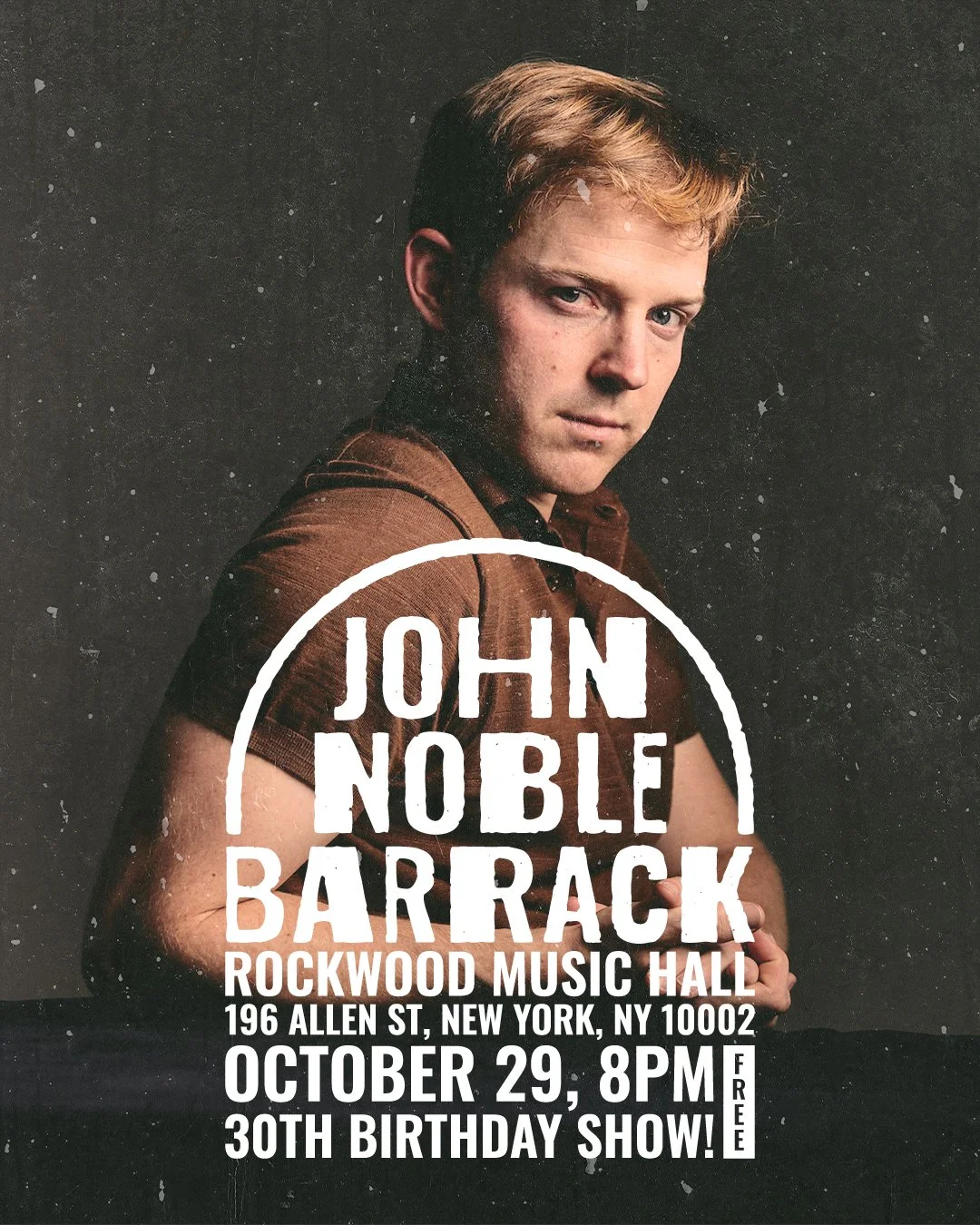
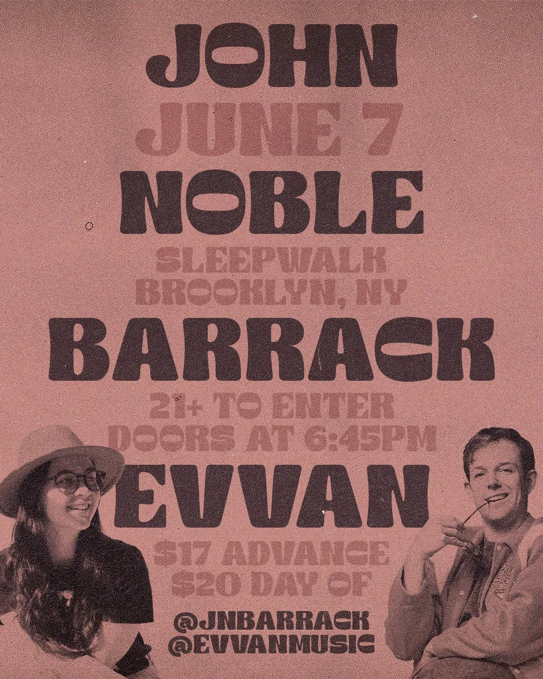
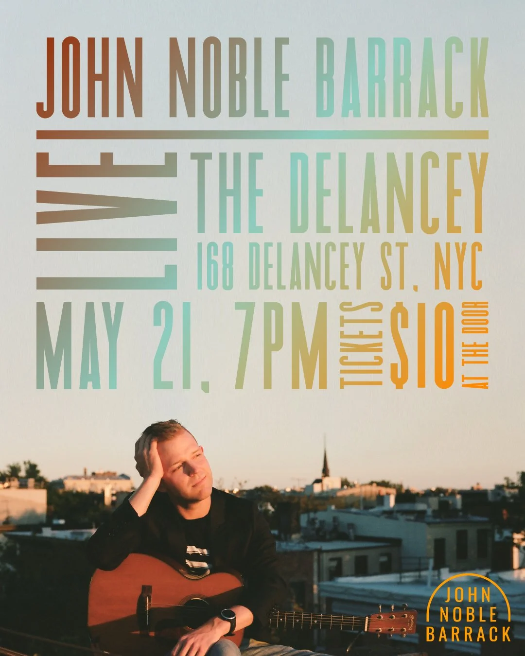
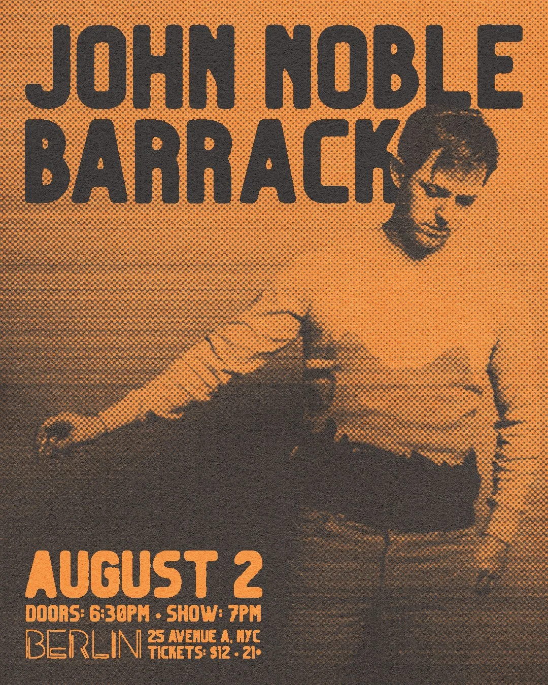
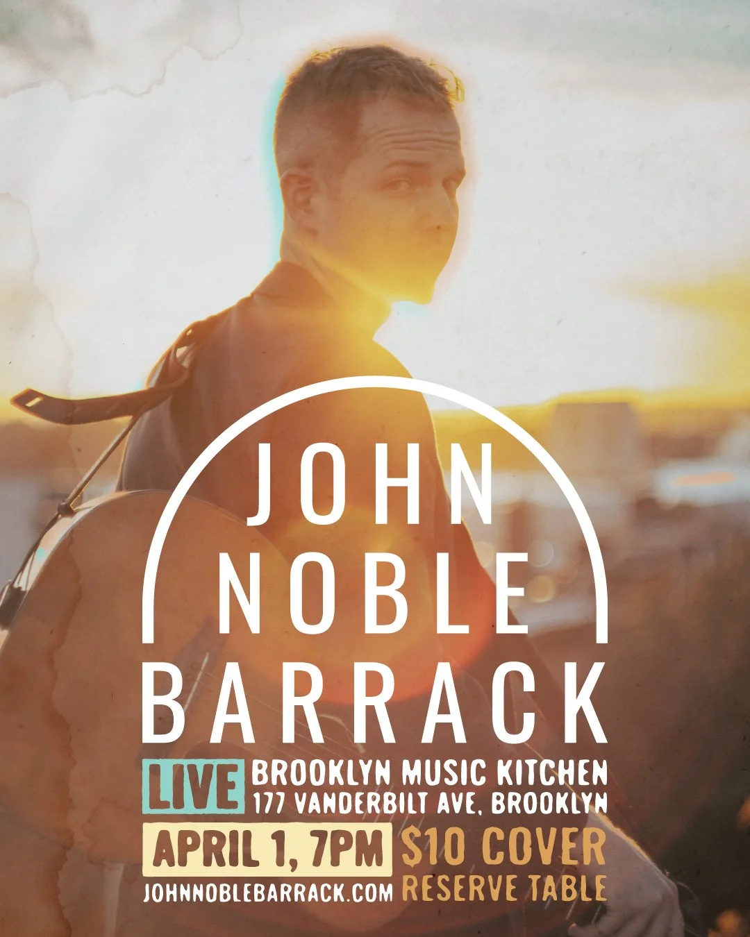
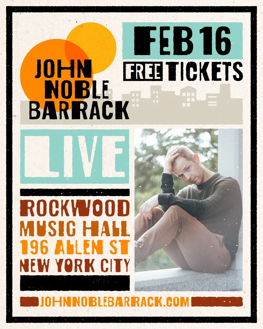
John Noble Barrack
Logo & Show Flyer Design
John Noble Barrack (or JNB for short) is an LA-based folk/rock singer-songwriter who weaves stories of grief, hope, death, disillusionment, and euphoria through the eyes of a New Englander. He also happens to be a good friend of mine.
Over the years I’ve designed JNB’s logo, the goal of which was to create something that visually matches his gritty, folky sound, and a bunch of flyers for his live shows.